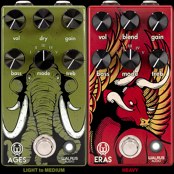
Don't Worry about Missing out on Limited Edition Pedals - Original is Often The Best!
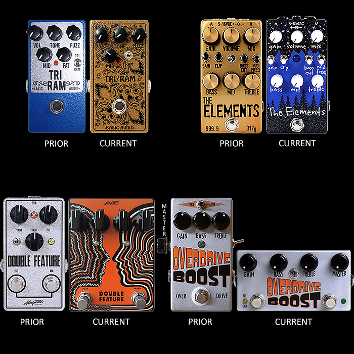
In a recent piece I slightly bemoaned the prevalence of second edition pedal iterations that held more appeal than the originals - and how that if you bought to soon you might end up with an aesthetically inferior model. So this article is the direct antidote to that where I highlight pedals than in my opinion look best in their original release artwork.
Pedal Design is very much an applied art - where name, function, format and colourway are all expertly selected and combined to convey the key functional aspects and mood of a particular pedal. This applied art is the perfect marriage of form, function and mood - and where colour always plays a significant part. Colour can indicate if something is warm or cool, aggressive or chilled and other key behavioural and performance characteristics. Within applied art there is also a focus on Suitability, Legibility and Practicality of artwork - how legible and discernible the control legends are - how intuitive the control topology and overall function and how the artwork frames and enhances all of that. In fact the artwork often has a very significant say in the success of particular pedal.
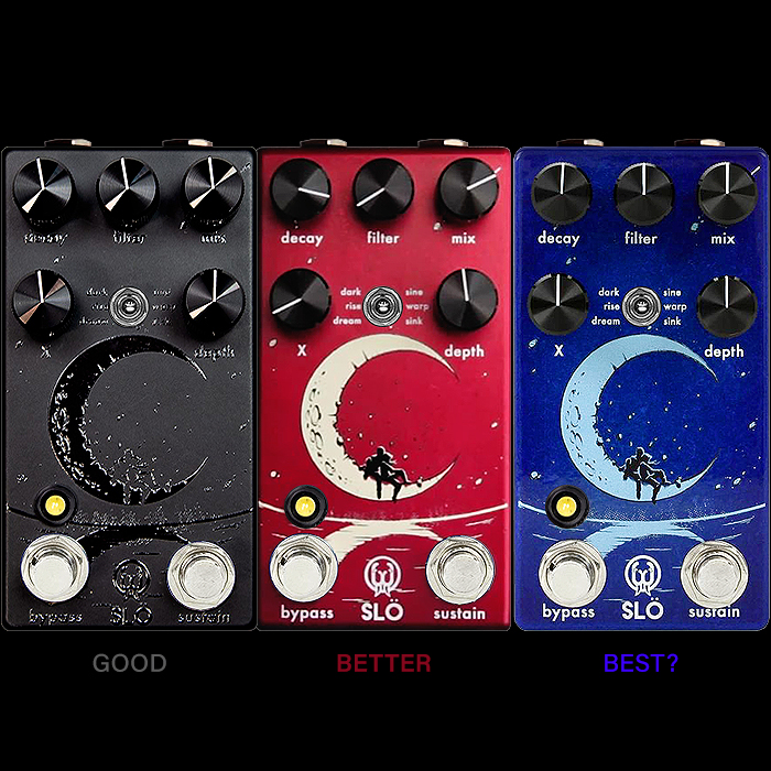
And so we come to Walrus Audio’s Metallic Red Anniversary Edition of its SLÖ Multi Texture Ambient Reverb - which is the third iteration / colourway of this artwork design, and in fact the 4th artwork iteration for this pedal overall - more about that later. I personally always liked the Twilight Blue original edition - that colourway for me exactly evokes the right Ambient mood for the pedal - and to my mind best suits the form and function of the pedal. The new Red artwork is a beautiful sort of pearlescent metallic colour which is no doubt an attractive shade of red - but does not really evoke the right mood here. A more sunset-like orangey-red hue might have evoked the dusky hinterlands of ambience - while the selected shade is somewhat post-apocalyptic in appearance - and to me at least a little at odds with its functional mood.
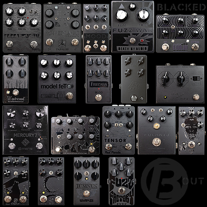
The second iteration of this design was last year's Black Friday BlackedOut / #blackedxout version of the pedal which I always thought did the pedal no particular favour. There is of course a certain coolness with blacked out stealth-style editions - but on this occasion I feel the original artwork and mood is relatively poorly served by the all black make-over - also making the legends impossibly illegible. For simple pedals with very few controls I think that blacked-out artworks can work quite well on occasion - as long as the artwork is suitable for that purpose - for more elaborate artworks and more complex control topologies - blacking things out is simply likely to do a disservice to the pedal.
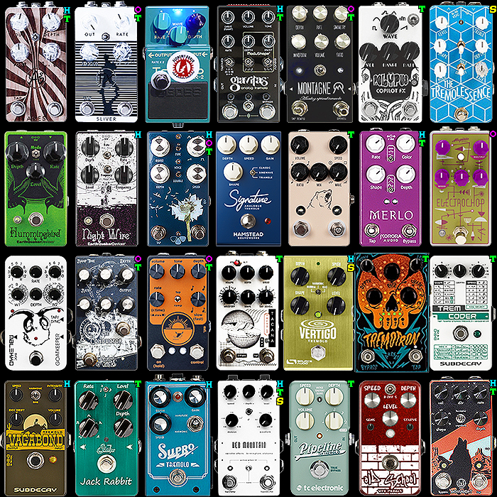
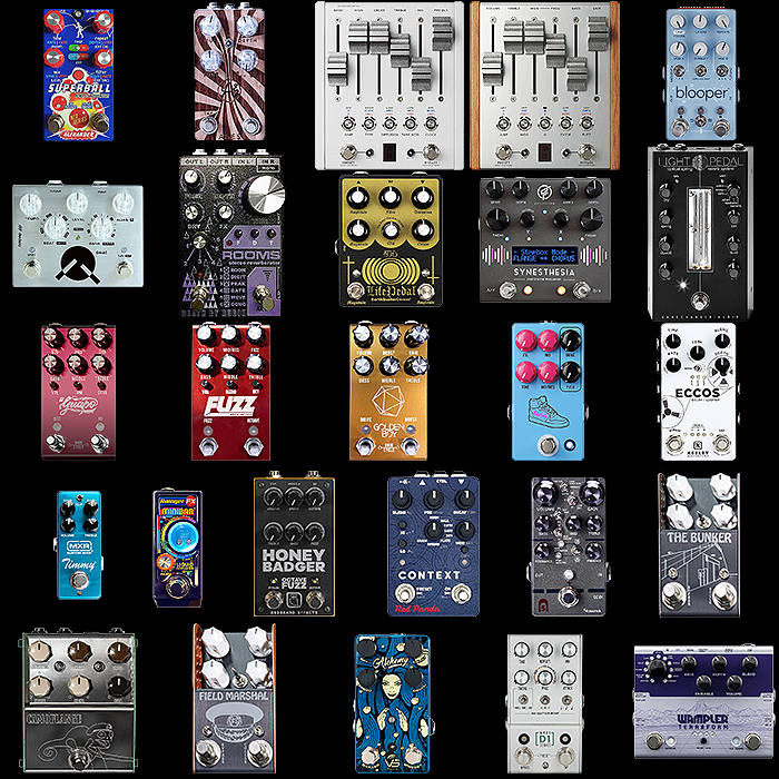
In the above visual of all the BlackedOut iterations - 19 pedals across 17 brands, I personally only felt that 3 or 4 of those were entirely successful - the EQD Westwood, JHS Cheese Ball, Land Devices / Farm Pedals No Masters Fuzz and the Meris Mercury 7 Reverb. The latter three all have a sort of embossed effect which elevates those derivations, and the original relatively simply artworks lend themselves well to the conversion. For the vast majority though - including all 3 of Walrus Audio's iterations, I felt that the original artworks were much preferable. You also see increasingly pedalboards all in one colour - which is a neat visual trick - but really poor on usability. Having differently coloured pedals helps you quickly see what's going on and where - and makes thinks easier to tweak on the fly as it were - while all stealth editions would make tweaking much more difficult to accomplish.
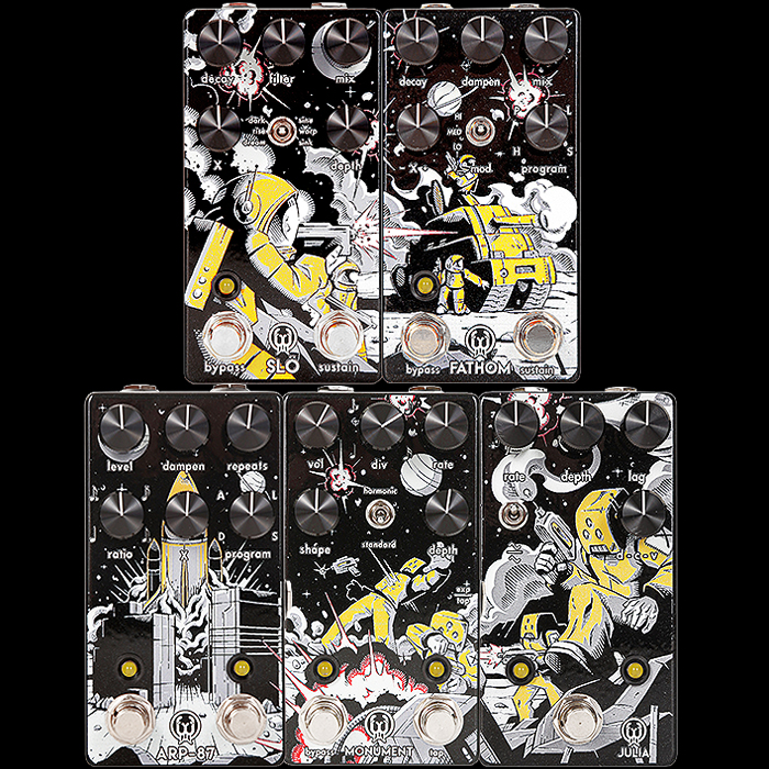
I mentioned that the Red Anniversary Edition was the 4th iteration of the SLÖ - as in between the BlackedOut and Red releases there was also the Andertons Luna Artwork collaboration per the above visual. Here the pedal artwork takes on a diorama Space Battle scene with the visual spread across all 5 pedals in that limited edition offering. For me the artwork could be split nicely into two segments which is what I did in my visual. The Manga styling of the visual is cool - but I'm really not sure a militarised astronaut firing off some sort of pulse weapon is the most suitable representation of the SLÖ's functional characteristics and persona.
Conceptually it's really cool, but only fully properly cool if you have all 5 pedals - and then like I said - I really don't feel that the artwork suits the naming or functional aspects and mood of each of these pedals - in fact I can't extrapolate the 'applied art' element here really besides stretching the diorama across these particular 5 pedals. Very cool for sure - but not particularly appropriate. I also really like the original artworks of each of those pedals - actually I prefer the new Julia artwork - so that is a V2 exception - but in essence I prefer all the more readily available iterations to the limited edition alternatives.
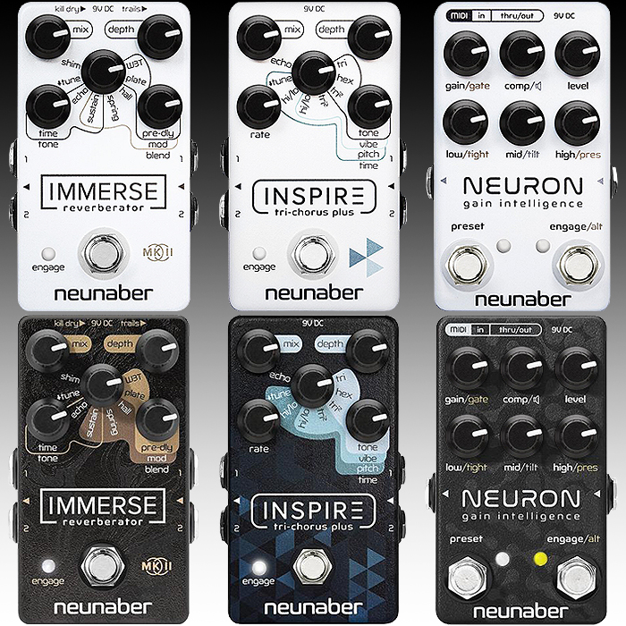
When everyone else was releasing BlackedOut Stealth varieties of their pedals for Black Friday - Neunaber decided to play opposites and go for all-white versions of their iconic designs. The Neunaber pedals don't have the same narrative application of artwork as the Walrus Audio editions - these are simply geometric patterns differentiated by colours, shapes and textures. The original Black editions have significant texture in the design of their backgrounds and some really clever colour-coding and smart visual styling to make the control topologies more intuitive and user-friendly.
All that is kind of lost on the more minimal white editions as we loose the textural elements and the colour-coding. This in and of itself means that the white-out versions are very much functionally inferior and less intuitive. For me I really like the contrast between the original black and the stepped / sort of vignette colour-gradations of the mode legends. For sure the white editions kind of look cool - but they are very much aesthetically and functionally inferior!
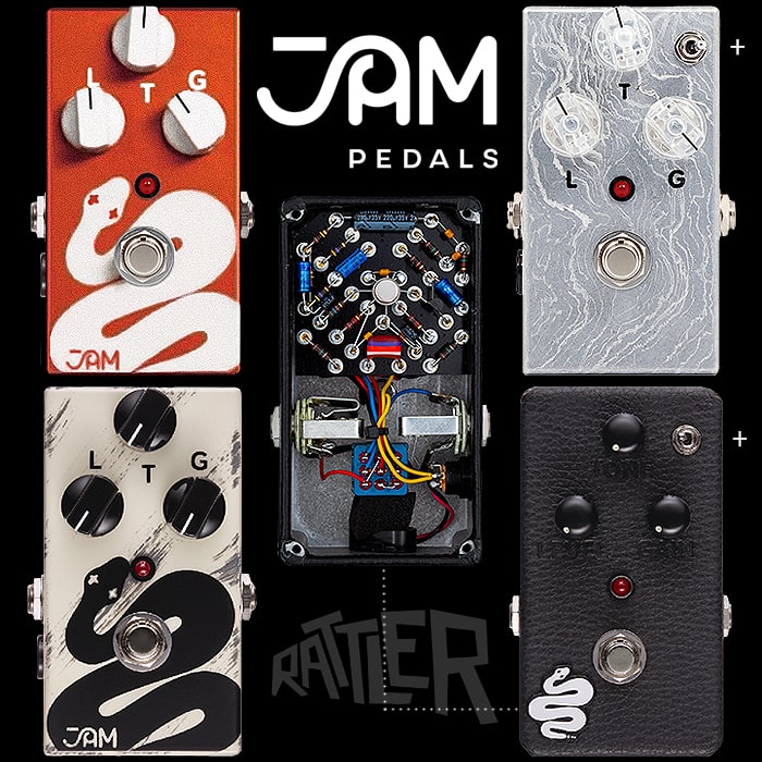
For the last segment we will focus on a rather inglorious and slightly embarrassing incident which I got wrapped up in last year - namely the That Pedal Show Limited Edition JAM Pedals Rattler episode! I'm an avowed fan of Dan and Mick - and usually catch each of their many weekly episodes. I'm not really a Mug and T-shirts type of person - I generally don't like logo-Tees - while I've always quite wanted some sort of memento of my That Pedal Show experience.
When the limited edition JAM Pedals Rattler was unveiled I though it a great opportunity to satisfy both my craving for that pedal which had been on my wishlist for a while and to have a proper memento of the show. I quite liked the special edition glittery metallic orange colourway and kind of fixed my desires on that particular pedal. Various announcements went out as to time and place that these pedals would be launched / sold - on the That Pedal Show store. And many of us waited in eager anticipation of the evening scramble - which alas never materialised. At the appointed hour nothing appeared on the store - it later turned out that the Patreons had snagged all the available quantity and that the pedals were in fact long sold-out before the appointed hour. Truth is that That Pedal Show did a rather poor job in communicating any of this - too little too late etc. and in response I rather vented my ire on the situation - somewhat unnecessarily as it turns out.
I very soon after acquired both Custom Shop editions of the Rattler Plus and one of the V2 / V3 standard editions of the Rattler - with that cool textured effect in the paintwork - which I actually significantly prefer in retrospect - to the TPS Orange Edition. I had just become so fixated on the TPS edition and so disappointed by the process that I got carried away on the day. So my advise is to keep your cool and just bide your time - if you're patient enough most things become good in the long-run. And if you wait long enough one of those editions will sooner or later turn up on Reverb.com if you still really want one!
Final Thoughts
Some will say there is a high degree of subjectivity in all of this - but that is not really the case with Applied Art. In the sense that this sort of Art is a Science too - with measurable and quantifiable goals, parameters and metrics.
As a Brand Strategist / Brand Engineer - I do a lot of work with Brand Profiles - which involves defining the personalities of brands and products - their core reflections and nature of appeal - based on shared visual signifiers and markers for the intended target audience.
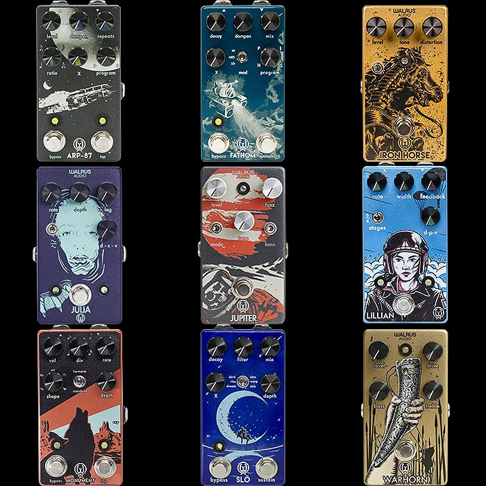
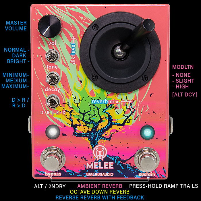
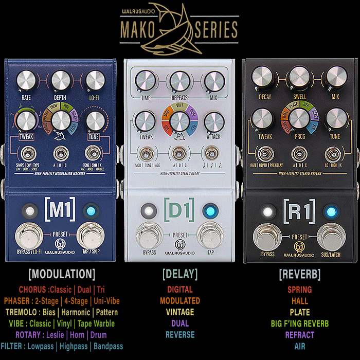
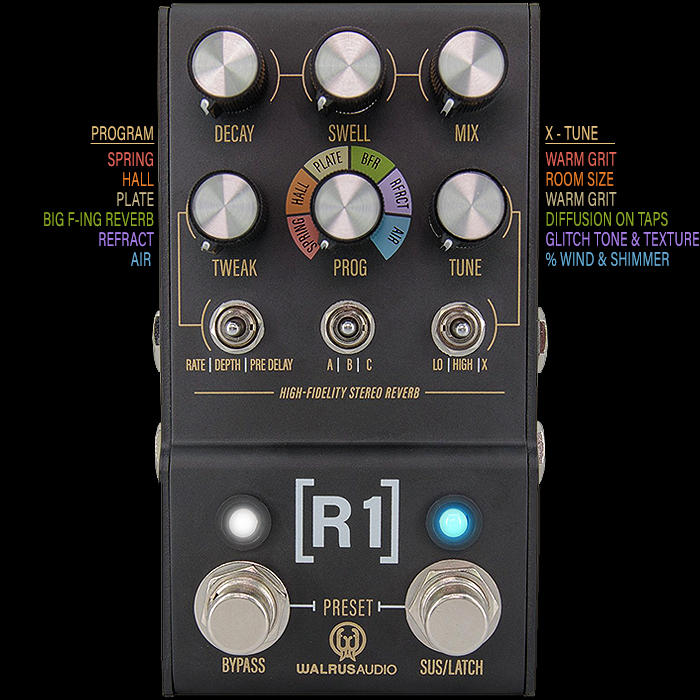
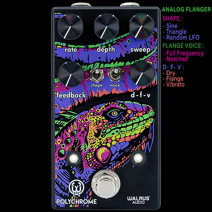
You can see the Applied Art discipline very much at work in the Walrus Audio pedals - as they each convey a narrative and mood which serves the functional aspects of the pedal. Most people also won't notice the clever slither-marks which appear texturally on the core JAM Pedals Rattler paintwork. It's a lovely small but significant attention to detail which enhances the appeal of that pedal.
When you have a larger pedalboard of 20, 30 or more pedals - then visual symbolism and signifiers become increasingly important for you to rapidly trace the origin of component parts of your sound - and be able to tweak them quickly and easily on the fly.
Few will appraise pedals with quite the same critical eye that I do - where I review on the basis of the proper scientific method and the applied and measurable arts. You can know by the type of pedal how well it's form and function is communicated and how well it is served by its enclosure artwork. Not all pedals are created equal - and some builders put considerably more time and effort into the conceptualising of those pedal artworks.
The functional aspect is always key though - as you don't really want the artwork to interfere with the usability / tweakability of a pedal. I'm sure this article will created a lot of commentary and feedback - and I encourage you all to approach this from a practical packaging perspective - where the design must serve the central mission and direction of the pedal - which is not always the case ...

